![]()
![]()
|
|
Dashboard gives you what information you will most often need.
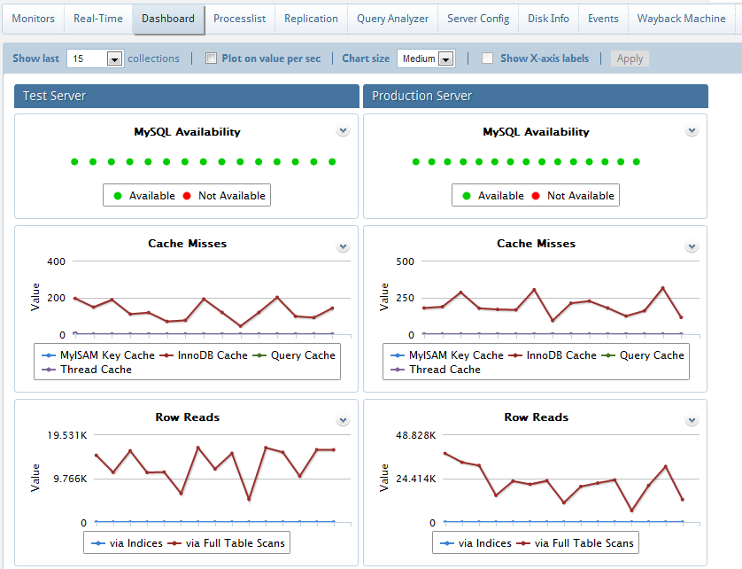
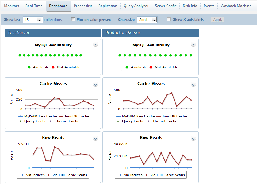
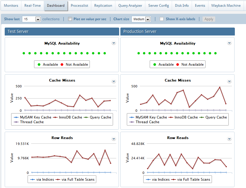
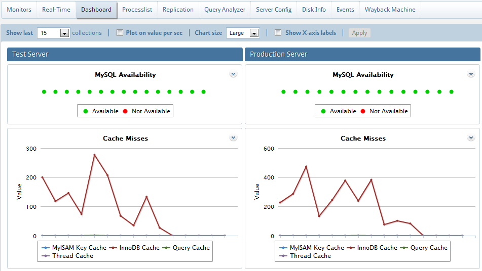
The Dashboard is a page displaying a graphical view of the server parameters and metrics that in most situations will give you a quick overview of the server load and performance. This includes the metrics:
MySQL metrics:
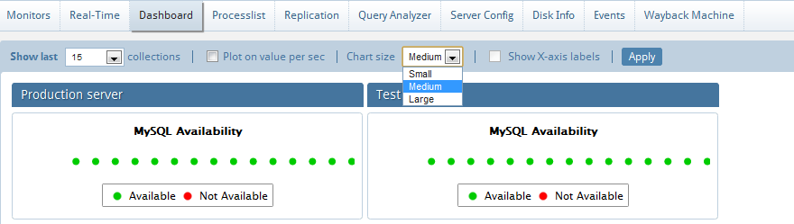
availability
number of connections per second
cache hit rates
number of different statements per second
System metrics:
availability
CPU
How is the refresh interval defined?
The dashboard will display data based on the 15 latest collections of data. Every graph displays related metrics using different colors. In the Dashboard interface the X-axis timestamps are not printed, and the time interval between each will reflect the server-specific setting for the sample interval. For that reason the display for different servers cannot be compared if this setting is different. Even the time-interval between the plotted values may vary for a single server if less than 15 samples are available since the sample interval was changed for that server. If no data are available for a period because MONyog service was stopped, two empty sample points will display in the grid no matter how long time has passed.
Dashboard settings can be changed from the Dashboard page itself. These are local (browser specific) settings that are stored in a cookie.
The no. of collections displayed in dashboard is configurable i.e. it ranges from 5 to 200. By default it is 15. If 'Older' is selected, it navigates to Monitors where we can plot charts on custom timeframe. See Dashboard recommendations.
Dashboard chart size is configurable. You can select from small, medium and large sizes.
X-axis values are only visible if your chart size is large.
You can hover on the anchor points on the charts to see the actual values.
We can also customize the look of charts by clicking 'Chart color settings' where you can change the colors to your choice. Refer Dashboard Chart Settings.
Recommended number of collections is 50 for better visibility.
Note: This recommendation is based on 1280 x 1024 screen resolution. So, depending upon your screen resolution the number of collections may vary to some extent.
Even the Dashboard is configurable.
You can customize the Dashboard page to include other counters/metrics as well. Just edit the 'dashboardmysqlcounters' and 'dashboardsystemcounters' JavaScript files. You can also choose to display only a single line (or any combination of lines) in a multi-line chart just by clicking on the buttons in the legend. For example in Connection history, if we want to view only refused connections we can disable 'attempts' or 'terminated abruptly' buttons. In this we can customize Cache hit rate and others to avoid confusions.
Pre-canned charts
The dashboard comes with with a bunch of useful dashboard charts which can be enabled/disabled from the ‘Manage dashboard charts’ in the Dashboard page. Select the chart(s) of your choice and click on Enable/Disable. There is also an option to re-order these graphs.
Also, Dashboard charts can now be exported as PDF/JPG/PNG formats. Refer "Exporting graphics".
NOTE: This feature is available in MONyog Professional, Enterprise and Ultimate.
|
|